Data Visualization in Business
Joseph E. Moreno
460-43-XXXX
Introduction
Data Visualization in Business has
been around since the early sixty’s. We
can go on and define it in many ways. Here are a few definitions: Data Visualization
is an emerging market space that is not well defined and is a breed of products
that feature a graphic component and a data component (Don Nachtwey). Stewart Deck defines Data visualization as
the graphical representation of a data collection, often in an interactive
form. Modern data visualization tools
present data to users as charts, graphs or maps and let users sort, subdivide
and combine groups of data in graphical form to help discover patterns and
illustrate what they’ve discovered. Data
Visualization is the use of graphics to make sense of the reams of data that
are available for analysis and decision making (Peter L. Brooks). I will say that data visualization is a collection
of data that is for information relative to the subject seeking shown through
the use of graphic’s such as bar, line, and pie charts.
We have
used data visualization since computers were born. Back then the use of collecting data was
immanent, but they didn’t know what to do with it. Finally, the hardware was available to make
graphics and the results produced statistical graphics that could be used to analyze
data. For example, Chang (1970) explored
rotations in 5-D to detect 2-D structures.
Since then we have fast computers and software to use real time graphs
and make strategic business decisions which can help businesses cut costs and
make profits. With this in mind we will
always be innovated and spend money for the tools in data visualization.
Background
of Data Visualization
Since the late 1960’s, research in
statistical graphics and the invention of the computer has lead to the
development of a basic form of data visualization. It wasn’t even called this until they had a
solid form of it. For the first time
moving pictures of data were displayed and a user was able to interact with a
plot in real time. For example Kurskal
(1964) watched a multidimensional scaling algorithm converge to a stable
configuration; and Fowlkes (1969) explored interactive probability plotting. In
1974 Fisherkeller, Friedman, and Tukey were the first to create seminal
software that was the first dynamic multivariate data visualization system. This
software was called PRIM which means Picturing, Rotation, Isolation, and
Masking. It had tools for drawing plots, rotating variables into the plots, and
conditionally masking points according to variable values. The first data graphics required considerable
low-level programming to make the graphics terminals draw. An example, as
verbally communicated by Andrus Buja, is that John McDonald “programmed Orion
(McDonald 1892) in Pascal on a Sun board and in Mortran on the IBM-360
emulator. The Sun board had no operating system, but it had some Pascal
routines that acted as a raster display device driver. This was a nightmare, but thankfully
operating systems have developed considerably.
Some include MacOS, X11 for UNIX workstations, and Microsoft
Windows. Similarly, programming
languages have also evolved such as, formula-based, like Fortran, to
objected-oriented schemes for organizing complex systems, like C++.
Data
Visualization differs from information visualization, scientific visualization,
and cartographic visualization.
Information visualization is broader than data visualization. It seeks to visualize more generally
unstructured information-for example, visualizing lines code in software (Eick
1994). Scientific visualization is
primarily concerned with visualizing 3-D, or 3-D + time phenomena, such as for
medical purposes, displaying molecular structure of drugs, or in construction
projects, displaying architectural prototypes.
It involves more physical realism.
Cartographic visualization concerns visualizing maps, geography, and
spatial domains. But these types of
visualizations are not mutually exclusive, and indeed it is common that data
arise in conjunction with a geographic component, or from restructuring lines
of code into counts of particular expressions, or from databases of chemical
properties of molecules. So it is common
that data visualization needs to be done simultaneously with other types of
visualizations (Peter Sutherland).
There are
three basic fundamentals in forming data visuals. One fundamental principle is that a display
should be focused on data. While this
seems like an obvious concept, it is one that is often ignored. Designers often clutter up icons and make the
chart hard to understand, and what it is trying to visualize. The second is the order of data can have a
significant impact on a viewer’s ability to understand it. When you design a graph, chart or user
interface, resist the temptation to add extraneous graphical elements that
don’t clarify or expose the deeper meaning of the data (Robert Craig). If you
follow the basic principles, you will create data visuals which will insure
your decisions.
The purpose
for data visualizations is to help analyze data and put it into an easy to read
graphic. It is for the purpose of everyday business user who relies on the
examination of business statistics to keep ahead of the competition. Visualization technology allows everyday
users to easily see trends, determine patterns and spot anomalies in large
amounts of data without requiring high-end workstations, statistical knowledge
or specialized training. Findings are
displayed in easy-to-understand, animated graphical multidimensional reports
and presentations, employing a combination of advanced video, digital imaging
and animated multi-dimensional graphs (Humberto C. Gerola). Data Visuals help make decisions on current
information and they are as accurate as the information lets it be. Overtime data visualization tools will cover
more areas of business and thus increases the purpose for using it.
Data
Visualization in the Present
Our ability
to understand data and make business decisions based on it is being undermined
by the sheer growth in both the breadth and depth of data in most organizations
(Peter Brooks). Another sector heralding the benefits of data visualization is
the dealers and resellers, who can take advantage of its easy-to-use graphical
interface in showing customers multitude of features and advantages this
technology has compared to its predecessors (Humberto C. Gerola). An analyst armed with access to data
warehouse, knowledge of statistics, an understanding of the data, and a data
visualization tool can find data relationships that would not be readily
apparent using simpler tools that deliver only two dimensional bar, pie, or
line charts. Analysts use advanced data
visualization capabilities to interrogate, explore, and display data using
sophisticated charts, multidimensional images, and numerous screen controls
(Peter L. Brooks).
Data
Visualization in the Data Warehouse
Although
you can use data visualization tools in a standalone environment, they are most
effective when used to analyze information contained in a data warehouse. By providing improved analysis capabilities
to warehouse users, the data visualization tool increases the value that is
obtained from the warehouse. The data
warehouse, by containing cleansed and consistent data, increases the
effectiveness of data visualization tool to perform data scrubbing. Data mining is one area in which the use of
advanced data visualization products is growing. Data visualization, by itself, can be an
entire form of data mining application.
Following this approach, an analyst would build numerous data displays
to determine the most meaningful graphics.
The differentiating factor in using data visualization rather then
machine-based discovery data mining methods is that data visualization lets you
directly incorporate human ingenuity and analytic capabilities into the data
mining process. Other data mining
techniques—machine-based discovery approaches such as statistical regression,
rules-based reasoning, and neural networks—use mathematical calculations to
identify interesting data relationships (Peter L. Brooks).
Data
Visualization Technology
Two primary types of tools are used to
develop advanced data visualization development applications: specialized
programming languages and GUI exploration and development tools. Development using data visualization
programming languages, which sometimes work in concert with GUI tool, is
performed using the following steps:
1. Extract all
data or a subset of data from its source into the data visualization tool
environment.
2. Explore the
data with the data visualization explorer tool.
3. Identify
key visualization needs and user interactions.
4. Use the
programming language to develop customized graphics and user dialogs.
5. Add the
developed applications to the GUI tool menu or accessible library.
Most advanced data visualization GUI tools
let developers access and analyze data, select visualization graphics from a
predefined set of templates, customize the graphics, and then add the graphics
to a library for access by end users.
Data visualization development with these tools is usually performed
iteratively using the following steps:
1. Extract all
data or a subset of data from its source into the data visualization tool
environment. Generally, once data is
loaded, all graphics are available for browsing and exploration.
2. Customize
graphic templates that are of interest.
3. Explore the
data by looking at graphics, changing the color scheme, rotating the graphics,
and/or zeroing in on interesting areas for further investigation.
4. Add the
selected graphics to the GUI tool menu or accessible library.
There are
many forms of data visualization tools or software. I am going to name a few in the following
paragraph. Visible Decisions’ Information
Animation consists of the Discovery for Developers object oriented toolkit and
Anna, a dynamic interpreted object-oriented programming language. Visible
Decisions’ development methodology consists of the following steps:
1. Acquire
data.
2. Model
data.
3. Attach
views.
4. Create
interactive controllers.
5. Create a
landscape.
Belmont Research offers two primary data
visualizations products: CrossGraphs and CG++.
CrossGraphs lets you simultaneously explore data by displaying
statistical graphics partitioned across selected dimensions. The result a series of graphs displayed on
one screen is used to understand data relationships that either would not be
found by looking at single, simple charts or would require an excessive effort
compared to CrossGraphs. See figure 1 (Appendix A) shows a CrossGraph preview window
displaying bar graphs that show multidimensional retail sales by store, product
category, week, and type of promotion. To develop an application, you perform
the following steps:
1.
Create a new project that contains all of the
application GUI and source code files.
2.
Define and build the application using the GUI
Builder, Source Code Editor, and Browser.
3.
Test and modify the application using the Debugger
Console.
4.
Optimize performance and generate workspaces and/or
C++ for shared libraries.
SAS
Institute positions its data visualization software, SAS/Spectra view, as a key
component in the Explore step of its Sample-Explore-Manipulate-Model-Assess
(SEMMA) data mining process. Spectra view is an interactive high-volume
visualization tool for viewing, exploring, and analyzing large amounts of
multidimensional data. (SAS's Insight product lets you perform interactive data
visualization of histograms, scatter plots, box plots, and other statistical
graphics against smaller amounts of data with under 10,000 observations.) SAS/Spectra view consists of three major
functions to produce advanced data visualization: data loading and filtering,
image coloring, and volume visualization. All functions are performed using
pull-down menu bar commands (see Appendix B).
You can customize the color of data, text, missing values, and other
image attributes. The most interesting technique is specifying data value
colors. Users map specific colors to specific data values by using a data ramp. Once data is loaded into Spectra view, a bounding
box (consisting of the outlines of the 3D data visualization surface that
contains all variable values) is displayed and volume visualization can
proceed. All data visualization manipulation is done within the confines of the
bounding box. You can fine-tune graphs
by using rendering controls. "Rendering" is a term used to describe
the conversion of a set of points to presentation graphics (Peter L. Books).
The latest
edition of the Interactive data language makes programming easier and does not
require the traditional edit-compile-link-debug cycle of other languages. Previous versions of the language required
builders to learn syntax and write code to create their applications. IDL 5.0, however, features an
objected-oriented prebuilt graphic user interface for direct access to common
language functions. Another added
feature, IDL Object System, supports the language’s new interface and
architecture, and helps provide users with a consistent set of abilities
through a common syntax among objects.
The system supports encapsulation, polymorphism, multiple inheritance,
and persistence (David Herman).
Welcome to
the world of 3-D data visualization.
While 3-D technology has been around for several years, it is just
beginning to appear in a enterprise-level business applications, from decision
support to infrastructure management.
“We believe that 3-D will become the standard,” says Marc Sokol, senior
vice president of advanced technology at Computer Associates Int’l Inc. In part, Sokol says, the acceleration
adoption of 3-D technology is being made possible by improvements in desktop
computers. Applications that previously
could run on $100,000 Intergraph workstations can now be displayed on $3000
PCs, he explains. Some other companies
that implement 3-D technology in their Windows NT-based products include
Research Systems Inc. (
The latest
version, Spotfire.net 5.0, features enhanced data visualization capabilities
that will aid users in visually detecting data trends and anomalies, company
officials said. Greg Tuker-kellogg, a
senior scientist at Millennium Predictive Medicine Inc. in
Spotfire.net
5.0 Capabilites
·
More than 1 million records can be analyzed
visually.
·
It provides access to relational databases such as
Oracle, Microsoft Access, Sybase and Informix.
·
It offers support for visual-trellis plots and
split-plots views (Lee Copeland).
Visualization
tools can be useful in three areas, says Michael Embry, lead analyst for data
warehousing at retailer AutoZone Inc. in
·
Visual Insights
·
Silicon Graphics Inc.
·
Cognos Inc.
·
DataView Inc.
·
Epiphany Inc.
·
Quadstone Ltd.
·
MapInfo Corp.
·
Environment Systems Research Institute Inc.
·
MathSoft Inc.
·
Spotfire Inc.
(Stewart Deck)
Data
Visualization technology has been making a splash in the risk management arena,
and is expected to increase in visibility with the recent merger of two of the
lending players in the field. Analyzing the flood of information that comes
through financial services firms is a difficult task; therefore, being able to
see a snapshot of the data in the form of a chart or graphic is becoming a
welcomed accessory. One area where data
visualization has already proven its worth is risk management. “Apart from spotting defective data, it’s a
way of examining all sorts of relationships portfolio—some will mean nothing
but suddenly you might spot an unsuspected correlation,” says Catherine Morley,
principle consultant at TCA Consulting in
Of course
with all this new software being created we need new hardware to power the
software. I am about to talk about the
latest advances in computer hardware as they relate to data visualization,
modeling, and simulation. The HP
visualization center sv6 consist of a cluster of graphics-enabled workstations
interconnected with both a high-speed LAN at the SPU side and a digital
compositor at the graphics side. The
system includes three functional components; the master system, 3-D rendering pipelines,
and the image compositor. The master
system runs the application and usually controls the Xserver and distributes
the 3-D rendering to the multiple 3-D rendering pipelines. The 3-D rendering pipelines are responsible
for rending to a portion of the full application visible frame buffer. These pipelines enable the user to define a
screen space division for distribution of application tendering requests. Finally, the image compositor takes the
sub-screen rendering of each pipeline and recombines the multiple streams into
a single screen image for presentation.
The Sun blade 1000 is designed for a number of applications, from
software development and R&D to 2-D content creation, MCAD/MCAE and
embedded systems. It supports Sun
Creator3D graphics, Sun Elite3D M6 Graphics, and Sun Expert 3D graphics, which
provide high-performance graphics with texture-mapping acceleration for 3-D
applications in geotechnical, high-end MCAD, digital content creation,
visualization and simulation. But given
that collaboration is increasely necessary in today’s development environment,
the company recently introduced Visual Area Networking, which allows users to
interact with visualization supercomputers using any client device,
individually or as a collaborative community.
It removes the requirement that either the data or the advanced
visualization capability be local to the user and allows diverse teams of
people to visualize and interact with data.
Apple’s recently-released Power Mac G4 with dual 1-GHz PowerPC G4
processor can be used for complex data visualization, particularly when
partnered with Velocity Engine in Mac OS X clusters. By providing high-powered systems that can be
clustered into supercomputers, Apple insures that its products will gain wider
use in scientific visualization (Kim Sekel).
With time passing by and the use of data visualization becomes more
worthy, the software and hardware will adapt to the demands.
I would
like to offer four consumer standards that make sense. First, data visualization products are end
user tools. They don’t include products
that are defined as data base management, data ware housing, data acquisition,
etc. Second data visualization products
must have a graphic component that is tightly integrated with a data
source. Products that create lines
charts and graphs from spreadsheets and other desktop tools are not data
visualization products. In addition
changes to the data should be reflected in the graphic component. Third, data visualization products are
inherently analytical. Products that
render 3D imagery based on some specification data should be classified as
design software and not data visualization.
Fourth, data visualization products should do more than simply plotting
the data. Plotting data is typical for historical
analysis. Data visualization should have
some decision components (what if capabilities, parametric graphics, etc.) (Don
Nachtwey).
Visualize
the Future
Data
visualization graphics and techniques are being used to present information to
users in new and novel ways. Advanced data visualization tools are designed to
provide graphics beyond those of the simple business charts that can be created
by Visual Basic, PowerBuilder, spreadsheets, and OLAP tools. 3D graphics,
real-time animation, and intense user interaction and ability to customize
graphics are some of the characteristics of these tools. Users of advanced data
visualization tools generally require training in statistical analysis and
should have a deep understanding of the data being analyzed. This is unlike
tools with simpler visualization capabilities that are easily understood by the
casual user. Strong statistical analysis skills and detailed data knowledge are
required to build such graphics. The
performance of these tools is directly related to the size of the data being
processed, the complexity of processing, and the hardware platform being used.
Over time, performance will certainly increase, but currently most tools are
constrained by the previously mentioned factors. Data sampling, simplifying
graphics and using slower animation are techniques currently used to overcome
the performance inhibitors. As the
volume of available data grows and business graphics become commonplace, an
advantage will accrue to the organizations that are able to more quickly make
sense of their data -- a capability that requires human involvement and
interpretation. Even when using machine-based discovery data mining techniques
that can process vast quantities of data, you must analyze the results -- the answer
does not automatically appear. Advanced data visualization allows for the
interactive interpretation and analysis of large amounts of data that cannot be
derived from columns of numbers and that is not effective when displayed in
simple charts (Peter L Brooks).
Conclusion
In
researching all this information the thing that I learned is data visualizing
is a powerful and successful tool in business and any other fields who benefit
from it. From the research some ideas
have pop in my head to make data visualization tools better for the future. Imagine software that can take information
from where ever and break it down to graphs in real time. There is such software, but it can’t take data
and do future predictions through sampling over the past quarters or years. Have you ever heard of the saying “That history
repeats itself”? Now with that concept,
apply it to the new futuristic data visualization software called JEMS
Predictions, and do some sampling from previous quarters. After that hit a button on the tool bar, boom
there it is your future prediction of the company. This prediction will do the calculations
through multiple databases from your competitors and it will predict future
sales, profits, expenses and so on with real time data from those
databases. It sounds good and can be
possible with some research and development.
Currently all of this data now is visualized giving the users a where
about in the company for the past or in the present. My idea is to take the two and come up with a
future prediction. This is the future of
data visualization.
References
http://www.dbmsmag.com/9708d13.html , Sophisticated Graphic Visualization and
Development Tools Tailored for Business Application. By Peter L. Brooks,
Visualizing Data.
http://www.tdan.com/i008fe04.htm , Defining Data Visualization, by Don Nachtwey -
Thinx Software.
Kim
Sekel. “Computer Hardware for Visualization”, Scientific Computing &
Instrumentation, February 2002, pg. 20-24.
Andy
Webb. “Visualization Lends a Hand to Risk Arena”, Wall Street & Technology,
Apr.2000 Vol.18 Issue 4, pg 40.
Stewart
Deck. “Data Visualization: Hot Trends & Technologies in Brief Definition”,
Computerworld, 10/19/99 , Vol.33 Issue 41, pg 37.
Lee
Copeland. “Tools Enables Data Visualization and Trend Analysis”, Computerworld,
8/14/2000 , Vol. Issue 33, pg 55.
Stuart
F. Brown. “Making Decisions in a flood of data”, Fortune, Aug.13 2001, Vol. 144 Issue 3, pg 148B.
David
Herman. “Language for Data Visualization”, Mechanical Engineering, Jun 97, Vol.
119 Issue 6, pg 16.
Michelle
Rosen. “Data Visualization in Three Dimensions”, ENT, 12/09/98 , Vol. 3 Issue 20, pg 44.
Humberto
C. Gerola. “Data Visualization Analysis Business Information”, Computer Dealer
News, 3/12/99 , Vol. 15 Issue 10, pg 28.
Robert
Craig. “Data Visualization Principles”, ENT, 10/06/99 , Vol. 4 Issue 17, pg 25.
Sutherland,
Peter; Rossini, Anthony; Lumley, Thomas; Lewin-Koh, Nicholas; Dickerson, Julie;
Cox, Zach; Cook, Dianne; “Orca: A Visualization Toolkit for High-Dimensional Data.” Computational & Graphical Statistics, Sep2000,
Vol. 9 Issue 3, p509, 21p.
Appendix A.
Figure 1.
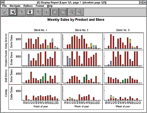
--A CrossGraphs preview window displaying bar graphs that show
multidimensional retail sales data by store, product category, week, and type
of promotion. (Courtesy Belmont Research Inc.)
Appendix B.
Figure 2.
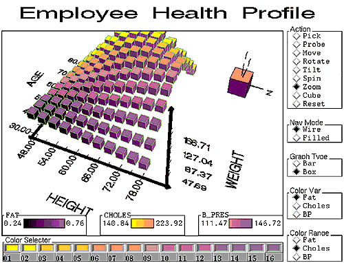
--A SAS/Spectraview BarChart object with controls to visualize employee
health data. The data includes observations for age, height, weight, fat,
cholesterol, and blood pressure; at the bottom is the color selector object
used to assign the colors. (Courtesy SAS Institute Inc.)